Kimberly Lofgren

How to Pick Your Wedding Colors

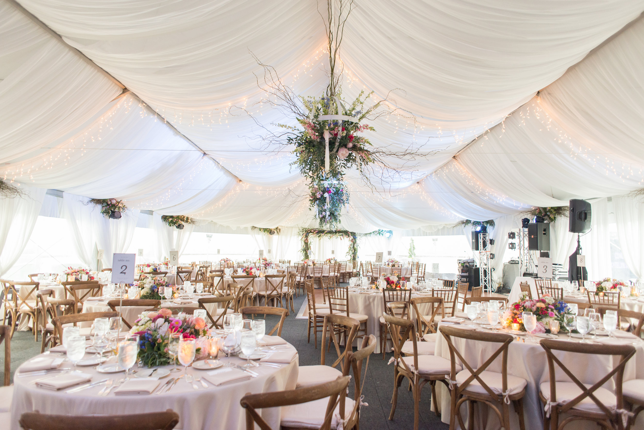
Arguably the most prominent element of design is color. It’s what most design clients want help with—whether it’s choosing a main color, or making sure secondary colors work together with the main color to create a mood or feeling.

With so many colors it can be hard to know where to start when trying to decide on a color scheme. Here are a few of the questions I would ask at a design consultation to help narrow down colors:

What kind of mood do you want to set at your wedding? Casual, glamorous, playful, fun?

Have you already chosen our venue? What does it look like, and what colors are already there?

What colors are you most drawn to?

What colors are you least drawn to?

What season is your wedding taking place?


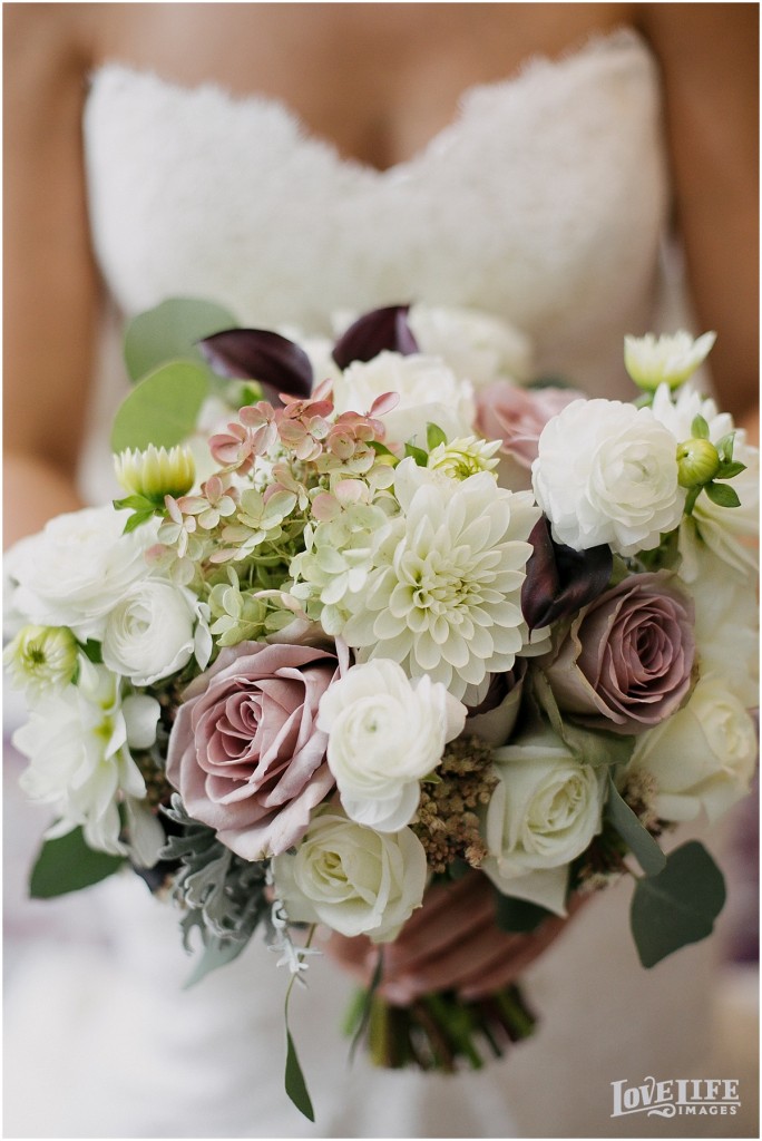
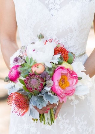
What colors are brought about in your mind after answering these questions? Color is a very personal and unique experience—no color combination is inherently wrong. Of course, some colors clash when used together, and some are displeasing to the eye, but it’s ALL personal preference. So don’t overthink it!


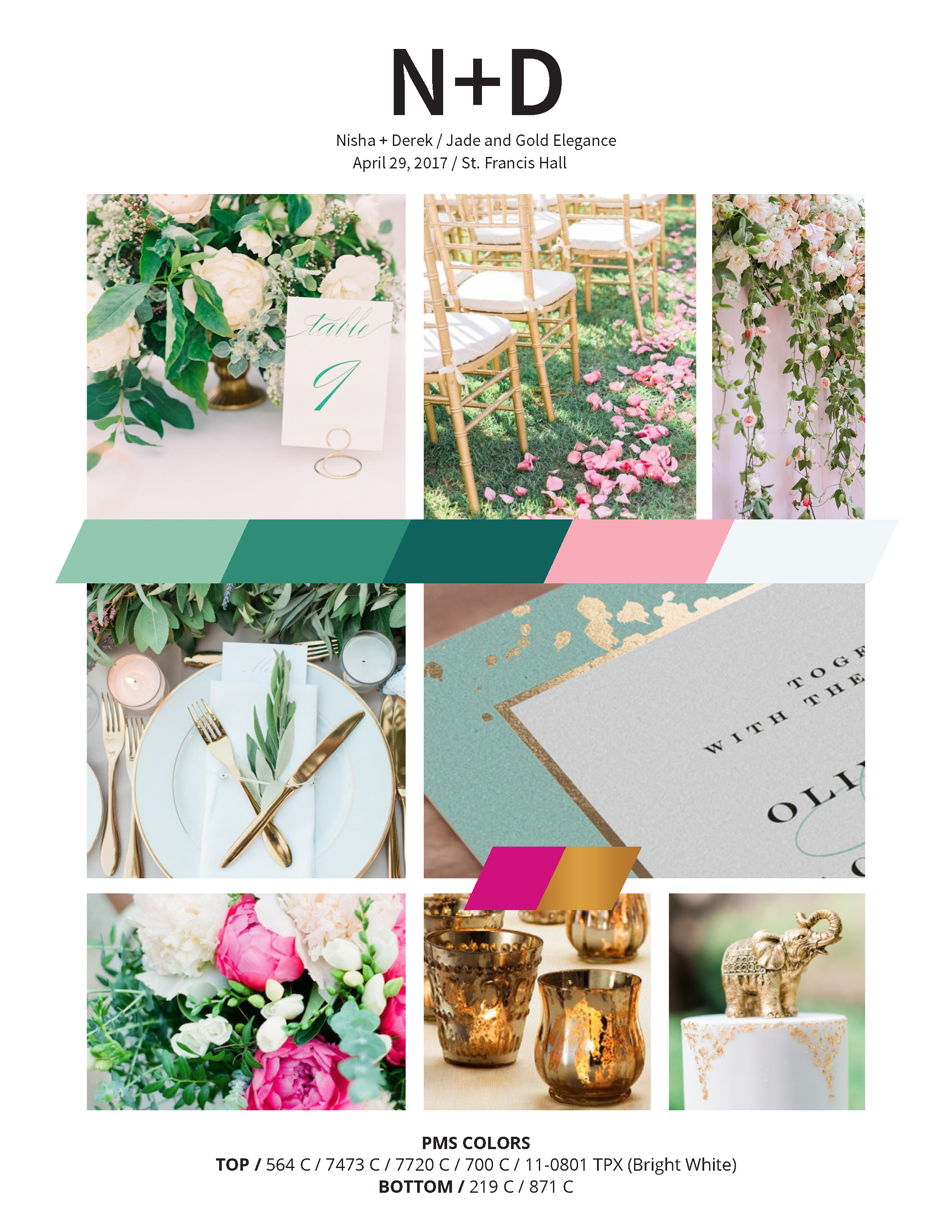
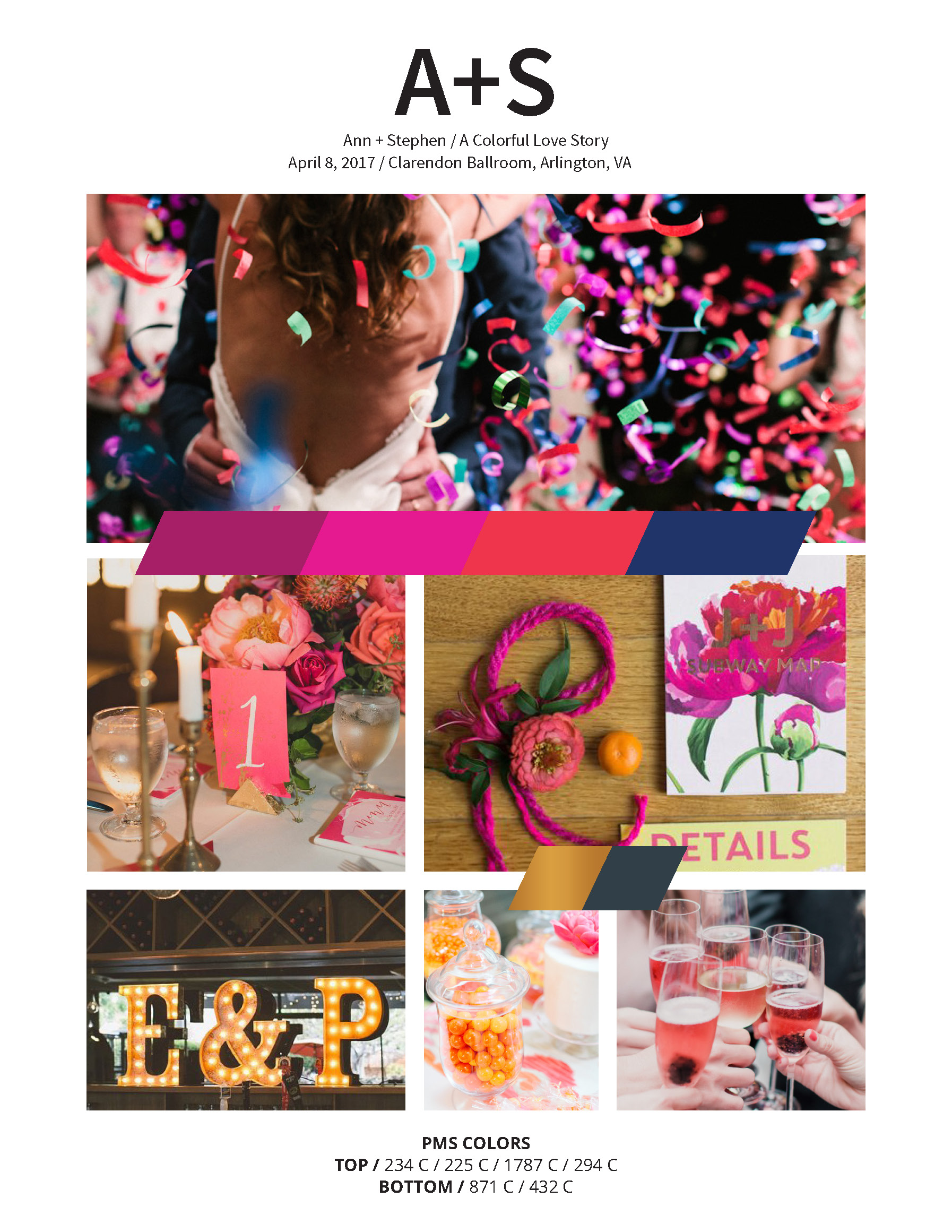
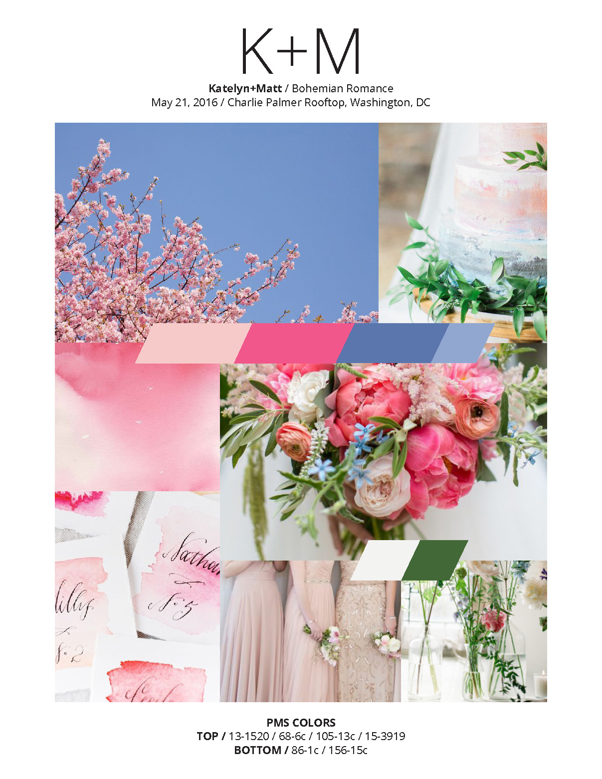
There are many, many ways to mix and match colors. Without going too far into the nitty gritty details of color theory, let’s focus on these three attributes of color: hue, tints, and shades.

Hue: The main property of color. How we describe colors. Ie. red, orange, yellow, green, blue, purple, etc.

Tint: White is mixed with a hue.

Shade: Black is mixed with a hue.

Knowing this basic terminology will help you better communicate your color preference with your vendors. Which brings us to....

Why being specific about your color preference is important.

When talking with your vendors, it’s critical to be specific about the colors you want in your wedding. Just saying you want green and pink incorporated can mean different things to different vendors. Emerald green or spring green? Magenta or dusty pink? The more adjectives you use to describe your colors the better your vendors will be able to narrow down exactly what color you mean. Then, on your wedding day you won’t be surprised by a color you didn’t want included.

Remember, don’t overthink your color choices. If you like the combination, go for it and be specific when communicating it.

Happy color picking!

The Elements and Principles of Event Design

For our first wedding design post, let’s start with the basics and discuss the elements and principles of design.

As a graphic designer, this was the first thing I learned in school, and it’s relevant to any design field-- including event design.

The elements of design are the pieces that make up design. There are six elements:

  • Color: light reflected off objects.

  • Line: a mark with greater length than width

  • Shape: a closed line. Shapes are flat.

  • Form: a 3-D shape

  • Texture: surface quality that can be seen or felt

  • Space: the area between or around objects.


The principles of design are how the elements are used together to make a complete piece of work. Let’s look at real wedding images to help define some of the more prominent principles:

1. Balance: the distribution of the visual weight of objects, colors, texture, and space. Here, balance is created with the long rectangular tables, paired with the smaller round tables.  

Photo by Olivia Jacob

Photo by Olivia Jacob

2. Proportion: when all parts of design (size, number) relate well to each other. At this wedding, the tall floral arrangements fill the space between the tabletops and the ceiling, giving the room and decor a sense of proportion to each other.

Photo by Charles Archambault

Photo by Charles Archambault

3. Emphasis: the part of a design that catches your attention. At Julia and Phil’s wedding the white globe lanterns are the largest piece of design and immediately draw your eye up into the reception space.

Photo by De Neuva Photography

Photo by De Neuva Photography

4. Movement: the path your eye takes around a design or space. At Katelyn and Matt’s wedding their florist added bunches of flowers at the top of each column in the tent and floral globes at the peak of the ceiling. This helps guide your eye around the entire reception space.

Photo by Jessica Latos Photography

Photo by Jessica Latos Photography

5. Repetition: when an object is repeated. This can create patterns and help the design feel cohesive. At Nisha and Derek’s wedding, their custom table runners were placed at every table, creating a pattern and making the room feel cohesive. The string lighting is also an example of repetition in the space.

Photo by Photo Lady Love

Photo by Photo Lady Love

6. Variety: the use of several elements to hold your attention and guide your eye. This wedding incorporated plenty of variety! They’ve woven together many complementary colors, different style plates, and mismatched chairs. It adds interest and personality.

Photo by De Neuva Photography

Photo by De Neuva Photography

7. Unity: a feeling of harmony between all parts of a design, which creates a sense of wholeness. At this wedding, they chose a neutral palette of tans and greens. The burlap tablecloths paired with tins of garden-like greenery create a cohesive modern-rustic look that doesn’t feel overdone.

Photo by Amber Wilke

Photo by Amber Wilke

There are many different ways to incorporate design principles into your wedding, so don’t be overwhelmed! Just being aware of them will help you better communicate your design vision to your vendors. But, if you’re still not confident you can execute your design vision on your own, check out The Plannery’s design services. We’d love to help!

Our next post will dive into everyone’s most discussed element of design: color!

Let's Talk Design

I'm emerging from the haze of newborn-dom to give you this blog post that was supposed to go up in November. Ah well, the best laid plans...

While I'm on maternity leave, our awesome event designer expert, Kim, put together some great design-focused blog posts for you. So without further ado, take it away, Kim!!!


Hey everyone! This is Kim, resident event designer at The Plannery. If you haven't heard by now, Katie is on maternity leave through February, so you'll be hearing from me for the next few months! I'll be discussing all things wedding design, so check back monthly for a new topic.

Before we dive into wedding-specific design, here's a little background about me:

I started collaborating with The Plannery in 2015, a few months after Katie coordinated my wedding. I enjoyed designing and planning my wedding so much, I reached back out to Katie to see if she needed help with her day-of coordination. She did, so I assisted her with a few weddings. Then, because of my background in graphic design, we came up with a plan to offer event design services through The Plannery, which has been up and running for the past year or so. The Plannery offers two design packages now: Moodboard Design and Full Design. You can read more about those here.

I'm a full time in-house graphic designer at a large consulting firm in DC. My role there encompasses many: I plan and design internal employee events and design marketing campaigns and materials that range from signage to booklets to websites. I also have previous work experience in advertising, print production, and editorial design.

One of my favorite parts about design is creating an entire suite of materials that are visually cohesive to support a brand or story. So, naturally, I was drawn to weddings as a way to tell a couple’s story through design.

I’ve helped a handful of clients since we started design services, and each couple has been so unique! Take a look at some of the moodboards we’ve done:

I hope you’ll follow along during the next few months to learn about the basics of wedding design, and pick up a few tips to help design your wedding on your own!